You Cropped One Image Five Ways and the Phone Number Fell Off the Edge
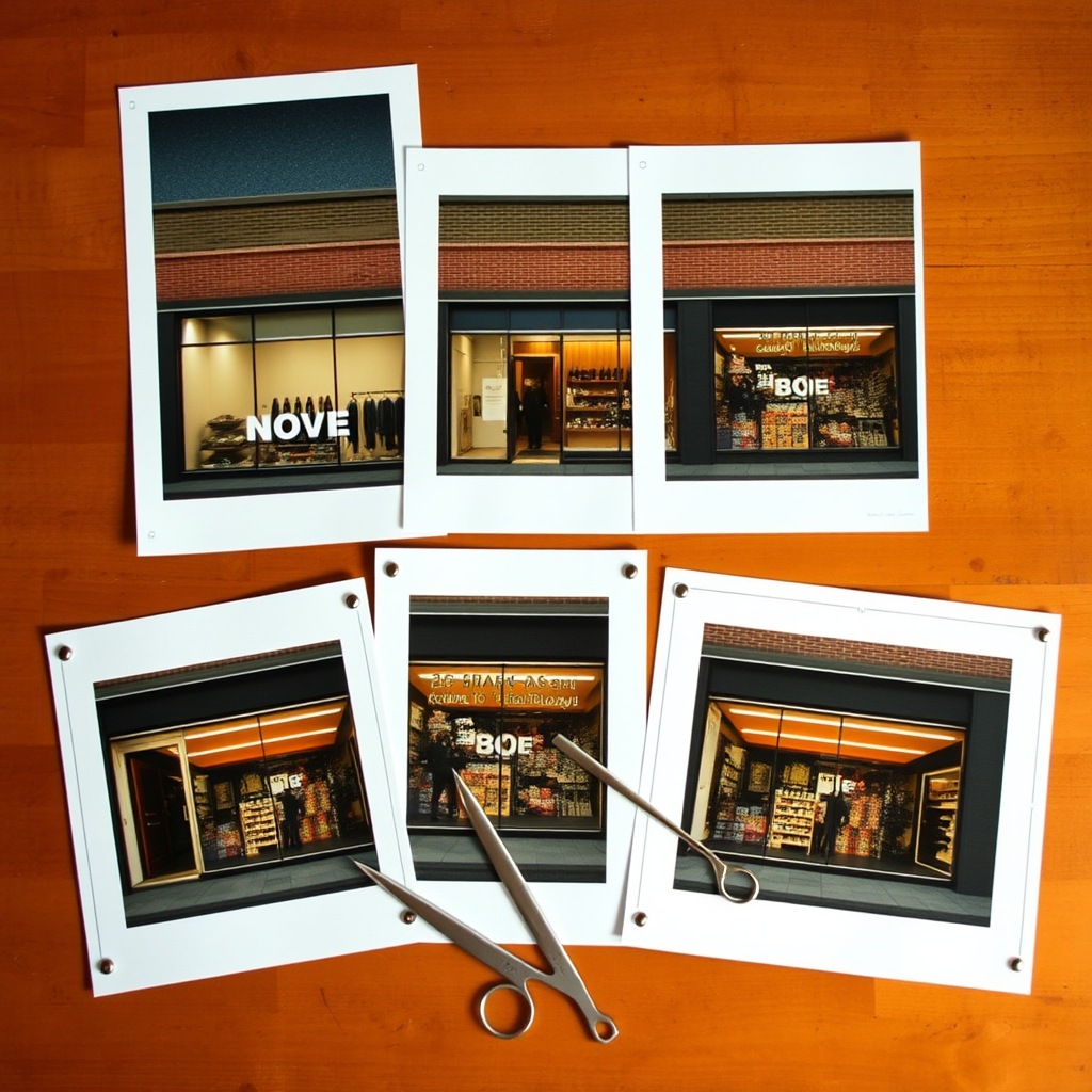
You made one good image. A square, probably, because square is what the design tool opened with. Then the week happened: the Instagram feed post was fine, the Story cropped the phone number off the bottom, the LinkedIn version pushed the logo into a corner, the email header squashed the product until nobody could tell what it was, and the Facebook cover put a face half outside the frame. Same picture, five destinations, four of them slightly wrong. Nobody complained. That's the problem — slightly wrong doesn't generate feedback, it just quietly underperforms.
This is the part of marketing that gets treated as production work instead of creative work. Choosing the message is strategy; getting it to fit a 9:16 frame is assumed to be a drag-and-crop chore. But the crop is where the message actually lives or dies. The customer never sees your original. They only ever see the version their channel served them.
Resizing Is Not Composing
A crop removes information. That's all it can do. When you take a square composition and cut it to a vertical Story, you are deciding — usually in about eight seconds, usually at the end of the day — which third of your own idea to throw away. The call to action tends to go first, because it was at the bottom. The brand mark goes second, because it was in a corner.
A vertical frame isn't a shorter version of a square one. It wants a different subject placement, different breathing room, different text position, often a different crop of the subject entirely. A wide email header wants the opposite: horizontal space to work with, a subject off-centre, room for a headline beside the image rather than on top of it. These aren't preferences. They're the actual constraints of the surfaces you're publishing to.
The honest version of what most teams do is this: compose carefully for one channel, then degrade that composition for the rest. If social is where your audience actually is, and email is where your offers actually convert, you're degrading the ones that matter.
Generate for the Shape, Not From the Square
The fix isn't more design hours. It's producing the image in each channel's aspect ratio from the start, so nothing has to be rescued later.
That's what the Growth7 content studio is for. You brief the image once and get it in every channel aspect ratio — each one composed for its frame rather than cut down from a neighbour. And because the studio takes your own photos as reference, you're not choosing between stock-looking generic imagery and a photo shoot you don't have time to arrange. Your actual storefront, your actual team, your actual product, rendered into the shapes each channel needs.
The practical difference shows up in how a campaign feels. One audience, one message, running across email, SMS, AI voice and social — and the visual layer no longer being the weakest link in it. The vertical version looks like it was made vertical. The wide version looks like it was made wide. Nobody has to notice; they just stop noticing the wrongness.
The Review Step Gets Shorter, Not Longer
There's a reasonable worry here: more versions means more to check. In practice the opposite happens, because what slows approval down is doubt. When you're looking at five crops of one image, you're not approving a campaign — you're inspecting damage, deciding whether the clipped logo is acceptable this once.
When each asset was composed for its frame, the review becomes a single judgement: is this the right message and the right look? Autopilot social and blog posting still waits on your yes, and you can give that yes from the iPhone app between other things. But the yes gets faster when there's nothing to forgive.
Start with whatever image you cropped most recently. Picture it composed for each of its destinations instead of trimmed into them. That gap — between what you made and what your customers actually saw — is recoverable, and it doesn't cost you a single extra hour of design time.