The Crop That Cut the Product in Half
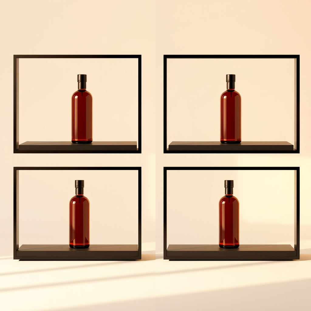
You had one good image. The product on a clean surface, the light right, everything sitting where you wanted it. It went up on Instagram as a square and looked exactly as intended. Then the email header needed a wide banner and the top third of the shot became a strip of empty table. The story needed nine-by-sixteen and the crop tool ate the left edge, which is where the product was. The LinkedIn card came out fine except the text you'd planned to overlay now sat on a busy background. By the time everything shipped, the same asset had been through four crops and only one of them was the picture you actually made.
This is one of the quietest costs in small-business marketing. Nobody logs it. It shows up as a campaign that went out a day late, or a channel that got skipped because reformatting for it wasn't worth the twenty minutes.
Cropping is a content decision disguised as a chore
When you crop a square down to a vertical, you aren't resizing an image. You are choosing a new subject, a new focal point and a new amount of breathing room around it. That is a creative judgement, and it's being made at the worst possible moment — late, by whoever is closest to the publish button, under time pressure, in a tool that shows the frame but not the finished post.
The result is predictable. Vertical formats get a centre crop that ignores where the eye should land. Wide banners get stretched or padded. Faces sit awkwardly close to an edge. Nothing is bad enough to stop the campaign, so nothing gets fixed, and the work quietly degrades one channel at a time.
The deeper problem is that the decision was never framed as a decision. A square photo is not the canonical version of your idea that other formats are derived from. It's just the first one you happened to make.
Generate for the frame instead of rescuing it afterwards
The fix is to move the framing decision upstream, to the point where the image is created rather than the point where it's published. If the same concept is generated natively at every aspect ratio your channels need, each version is composed for its own frame. The vertical has vertical composition. The banner has room for the headline. The square is a square because you wanted a square, not because it was easiest.
That's what the Growth7 content studio is built to do: produce imagery across every channel aspect ratio from the same brief, and take your own photos as reference so the output looks like your business rather than a stock approximation of it. Your real workshop, your real shelf, your real staff — rendered in the shapes each channel actually wants.
The practical difference shows up in three places:
- The channel you used to skip because reformatting was a hassle now gets posted to as a matter of course.
- Overlaid text lands on space that was left for it, not on whatever happened to be there.
- Nobody makes a compositional judgement at eleven at night in a crop window.
What this frees up
The reason most small businesses post less than they intend to isn't a shortage of ideas. It's that every idea has a tail of production work attached, and the tail grows with each channel you add. Email, SMS, social and voice all draw from the same campaign in Growth7 — but if the visual for each has to be hand-tuned, the tail is still there and the extra channels still feel expensive.
Removing the reformatting step doesn't just save time. It removes the reason you were rationing channels. When one idea can arrive correctly shaped everywhere at once, running the full set stops being an ambition and becomes the default. And the image your audience sees on a phone, in a vertical frame, at a glance, is the one you actually composed for that moment — not a survivor of the crop tool.